Example 7
HURDAT2 is a hurricane dataset provided by The National Hurricane Center and Central Pacific Hurricane Center. It contains the location data of hurricanes from 1851 to 2022.
This example shows how to use yupi for inspecting and processing a dataset of two-dimensional trajectories using HURDAT2 as an example.
- The example is structured as follows:
Note
You can access the script of this example on the yupi examples repository.
1. Setup dependencies
Import all the dependencies:
import json
import tarfile
import matplotlib.pyplot as plt
import numpy as np

import cartopy.crs as ccrs
import cartopy.feature as cfeature
Define global variables:
COLORS = ["#88ff88", "#ffee66", "#ffbb33", "#ff8844", "#bb1111"]
CATEGORIES = list(range(1, 6))
2. Load dataset
First we load the trajectories and grouped them into five categories according to the Saffir-Simpson scale.
tar = tarfile.open('resources/data/hurdat2.tar.xz', 'r:xz')
tar.extractall(".")
with open("hurdat2.json", "r", encoding="utf-8") as data_fd:
    data = json.load(data_fd)
    hurricanes = {cat: [] for cat in CATEGORIES}
    for cat, traj in zip(data["labels"], data["trajs"]):
        if cat > 0:
            hurricanes[cat].append(JSONSerializer.from_json(traj))
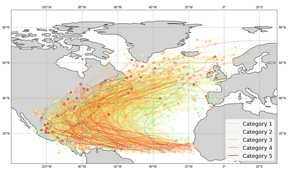
3. Plot all the trajectories
The trajectories can be easly visualized by using the plot_2d function of the yupi.graphics module. The map background is ploted using the cartopy python package.
Note
Installation instructions for cartopy can be found here.
fig = plt.figure(figsize=(16, 10))
ax = plt.axes(projection=ccrs.PlateCarree())
ax.coastlines()
ax.add_feature(cfeature.LAND, facecolor='lightgray')
ax.gridlines(crs=ccrs.PlateCarree(), linewidth=1, color='gray', alpha=0.5, draw_labels=True)
for cat, hurrs in hurricanes.items():
    ax = plot_2d(hurrs, legend=False, color=COLORS[cat - 1], alpha=0.3, show=False)

ax.update({"xlabel": "lat", "ylabel": "lon"})
ax.set_extent([-120, 30, 20, 50])
ax.legend(handles=[
    plt.plot([], [], color=color, label=f"Category {cat}")[0]
    for color, cat in zip(COLORS, CATEGORIES)
], loc=4, fontsize=18)
plt.show()
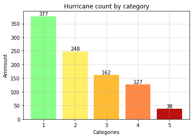
4. Data distribution
counts = list(map(len, hurricanes.values()))

_, ax = plt.subplots()
bars = ax.bar(CATEGORIES, counts, color=COLORS)
plt.bar_label(bars)
plt.xlabel("Categories")
plt.ylabel("Ammount")
plt.title("Hurricane count by category")
plt.grid(alpha=0.5)
plt.show()
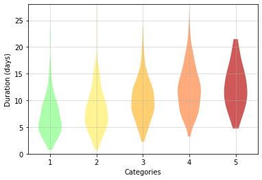
5. Duration analysis
The duration of the hurricanes can be inspected by substracting the first time record from the last one. Although there is not a huge difference, data shows how the duration of the hurricanes is slightly related to their intensity.
for cat, hurrs in hurricanes.items():
    durations = [(traj.t[-1] - traj.t[0]) / (3600 * 24) for traj in hurrs]
    _d = plt.violinplot(durations, positions=[cat], showextrema=False)
    _d["bodies"][0].set_facecolor(COLORS[cat - 1])
    _d["bodies"][0].set_alpha(0.7)

plt.xticks(CATEGORIES)
plt.ylim(0, 28)
plt.ylabel("Duration (days)")
plt.xlabel("Categories")
plt.grid(alpha=0.5)
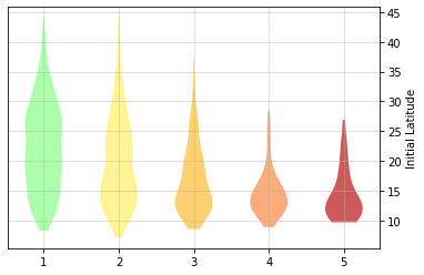
6. Initial latitudes analysis
By inspecting trajectories initial points (white dots in the spacial plots), we noticed that many hurricanes started their path in lower latitudes. We can gather this data by simply taking the first element of the longitude dimension of every trajectory (traj.r.y[0]). We can corroborate that hurricanes with higher intensity tend to start their path in lower latitudes.
init_lats_by_cat = []
for cat, hurrs in hurricanes.items():
    init_lats_by_cat.append([traj.r.y[0] for traj in hurrs])
    _d = plt.violinplot(init_lats_by_cat[-1], positions=[cat], showextrema=False)
    _d["bodies"][0].set_facecolor(COLORS[cat - 1])
    _d["bodies"][0].set_alpha(0.7)

plt.ylabel("Initial Latitude")
plt.grid(alpha=0.5)
plt.xticks(CATEGORIES)
ax = plt.gca()
ax.yaxis.set_label_position("right")
ax.yaxis.tick_right()